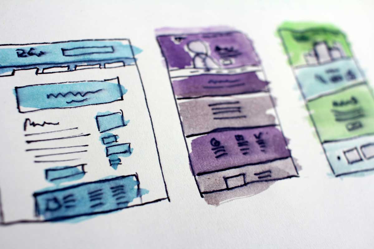
 Photo by Hal Gatewood on Unsplash
Digital design is all around us, from the apps we open first thing in the morning to the websites we use to shop, learn, and manage everyday tasks. When design is done well, it does more than look polished. It helps us move through a screen with less effort, understand information faster, and feel more confident about what to do next.
That is the real value of good digital design. It removes friction. It makes choices feel obvious. It turns a crowded interface into something people can use without second-guessing every click or tap.
The best digital experiences are rarely built from one dramatic idea. They come from a series of small, thoughtful decisions, how we arrange content, how we use color, how much space we leave, how readable the text feels, and how the interface works on a phone as well as on a desktop screen. When those decisions work together, the result feels natural.
Below, we will look at practical digital design practices that help us create interfaces that are clearer, more usable, and more pleasant to interact with.
Before we worry about layout styles, color trends, or visual flair, we need to understand what the screen is actually supposed to do. Every good design starts with a clear purpose.
A checkout page should help people complete a purchase with as little confusion as possible. A landing page should make the main offer easy to understand. A dashboard should help people find important information quickly. When the purpose is clear, design decisions become easier to make.
A useful question to ask is: what is the one thing users most need from this screen?
Once we know that, we can organize the page around it. Everything else, whether it is supporting information, optional links, or decorative elements, should stay in a secondary role. When we design with purpose, we stop treating the screen like a blank canvas and start treating it like a tool.
People do not read every part of a screen in order. They scan. They look for signals that tell them where to focus first. That is why visual hierarchy matters so much.
If everything on a page feels equally important, users have to work harder to figure out what deserves attention. Good hierarchy solves that problem by giving us a clear order.
Large elements naturally pull the eye. That is why headings are bigger than body text, and why primary buttons usually stand out more than secondary actions. Size helps us show priority without needing to say it out loud.
Contrast can come from many places, color, weight, spacing, shape, and even alignment. Strong contrast tells us something matters more. Softer contrast tells us something is supporting information.
For example, a call-to-action button might use a strong color, while muted text can sit quietly in the background. This keeps attention where it belongs.
Spacing is often underestimated, but it is one of the clearest ways to separate ideas. When content is grouped well, users can understand relationships more quickly. When sections are crowded together, the interface starts to feel noisy.
Clear hierarchy gives a design structure. Without it, even good content can feel hard to read.
Typography has a bigger impact on digital design than many people realize. It affects readability, tone, and trust all at once. If the type feels awkward, the whole interface can feel less reliable.
We do not need a font that tries too hard. In most digital products, clarity matters more than personality. Fonts that are simple, legible, and stable across screen sizes usually perform best.
Decorative type can work in small doses, such as a logo or a headline accent, but it should not interfere with reading the main content.
Too many font families, weights, or sizes can make a design feel messy. A simple type system is easier to maintain and easier for users to understand.
A practical setup often includes:
That kind of consistency creates a calmer experience.
Good typography is not just about picking a font. It is also about spacing. Line height, paragraph spacing, and line length all shape how comfortable text feels.
If lines are too close together, reading becomes tiring. If paragraphs are too far apart, the content feels disconnected. If a text column is too wide, readers lose their place. Typography works best when it feels balanced and intentional.
Color can guide attention, set mood, and make a brand feel recognizable. But if we use too many colors without a clear system, the result can feel cluttered and confusing.
A strong interface usually does not need a huge palette. A focused set of colors can do the job well:
This kind of system helps the page feel unified instead of random.
If a color is not helping with meaning, hierarchy, or identity, we should question whether it belongs. Color should support the experience, not compete with it.
Not everyone perceives color the same way. Some users have color vision differences, and others may be using a screen in poor lighting. We should never make meaning depend on color alone. Labels, icons, text, and shape should work together so the message is still clear.
White space, or negative space, is not empty space that needs to be filled. It is part of the design. It gives the eye a place to rest and helps content stand out.
When a screen feels crowded, people have to work harder just to separate one element from another. That adds mental load. White space reduces that burden.
It also shapes the personality of a product. More space can make a design feel calm, premium, and open. Tighter spacing can make it feel energetic or dense. Neither is automatically better, the right choice depends on the experience we want to create.
A meditation app and a data-heavy dashboard will not need the same spacing approach. One may benefit from breathing room, while the other may need a more compact system that still stays organized.
Mobile design is not a smaller version of desktop design, it is a different experience. If a layout only works well on a large screen, it is not finished.
Many people now interact with products mostly on phones. That means we need to think seriously about smaller screens from the start.
A phone screen has limited room, so clutter shows up fast. We need to keep the most important action and content front and center. Anything extra should be simplified, collapsed, or delayed until it is needed.
Buttons, links, and other interactive elements should be large enough to tap comfortably. If targets are too small, users make mistakes and lose patience. Generous spacing and clear tap areas make a big difference.
Text that looks fine on a desktop can become cramped on a phone. Images may lose impact if they are not scaled properly. Forms can become frustrating if fields are too tightly packed. We need to check how the interface performs in real mobile conditions, not just in a mockup.
Navigation should guide people, not make them stop and think. If users have to spend energy figuring out where to go next, the design has created friction.
Familiar patterns help reduce that friction. Top navigation, side menus, breadcrumbs, tabs, and search bars are common because people already understand how they work. Using these patterns gives users a head start.
That does not mean every interface should look the same. It means we should avoid being clever at the expense of clarity. If we choose to break from a standard pattern, we need a good reason.
Labels matter just as much as layout. Menu items should be specific and easy to understand. Clear words help people move faster. Ambiguous terms slow them down.
It also helps to show people where they are. Active states, highlighted tabs, and visible page titles all support orientation. Good navigation always gives users a sense of place.
Forms are one of the most common points of friction in digital products. They ask people to stop, think, and type, which means the design has to work harder to keep the experience smooth.
Every extra field adds effort. If a form asks for too much information too soon, people may abandon it. Shorter forms are usually easier to complete and feel less demanding.
When a form is long or complicated, dividing it into smaller steps can make it feel more manageable. A multi-step process works well when each step has a clear purpose. It reduces the sense of overload.
Good forms answer questions before people get stuck. Labels should be clear. Examples should be easy to find. Error messages should explain what went wrong in plain language.
A message like “Invalid input” is not very helpful. A message like “Please enter a valid email address” gives users something they can fix immediately.
Images and icons can improve understanding, but only if they are chosen well. When they are used without a clear reason, they become clutter.
Generic stock photos can make a product feel impersonal or even less trustworthy. Images should support the content and feel connected to the audience. If an image does not help tell the story, we may be better off without it.
Icons should feel like they belong to the same system. That means similar stroke widths, visual weight, and detail levels. If one icon is sharp and minimal while another is busy and decorative, the interface feels less stable.
Not every screen needs extra illustrations, photos, or decorative graphics. A simpler layout often communicates more clearly than one packed with visual extras.
Accessibility is not something we add at the end. It is part of good design from the beginning.
A screen that works well for more people is usually a better screen overall. Clear contrast, readable text, simple language, and well-structured interactions help users of all kinds.
We should make sure text stands out against the background clearly. Low-contrast combinations may look stylish in a mockup, but they can be difficult to read in real use.
We also need to think about keyboard navigation, focus states, and screen reader support. Interactive elements should be usable without requiring a mouse. Labels should be descriptive. Structure should be logical. When accessibility is handled well, the interface becomes more robust and more respectful of the people using it.
Motion can make a digital product feel smoother and more responsive. It can also become distracting very quickly if it is used without restraint.
The best motion usually has a job to do. It can show that something has changed, guide the eye to a new area, or confirm that an action succeeded. For example, a subtle animation can help users understand where a panel came from or whether a button press was registered.
But motion should stay in the background unless it is needed. Flashy effects can feel tiring. Overly busy transitions can slow the experience down. Simple, controlled animation usually ages better and feels more thoughtful.
Performance matters too. If motion makes a page feel sluggish, it works against the design instead of helping it.
Good design is rarely perfect on the first try. It becomes stronger through adjustment, feedback, and careful editing.
One of the best habits we can build is removing anything that does not help. Extra borders, extra labels, extra effects, and extra text often create more confusion than value. If something is not supporting the task, it probably belongs somewhere else, or not at all.
It also helps to ask where the design feels unclear. When we work closely with something for too long, we start to overlook its weak points. Fresh eyes can reveal problems with spacing, labeling, visual order, or interaction flow.
Small improvements matter. A cleaner layout, a simpler form, a clearer label, or a more readable contrast ratio can make the whole experience better.
A digital product is never just one page. It is a collection of repeated patterns, and those patterns should feel connected.
Buttons should behave consistently. Cards should follow the same logic. Headings should look related from one page to another. When the system is coherent, users learn it faster and trust it more.
This is where design rules become useful. Even a modest set of standards for spacing, color, typography, and components can make a product much easier to manage. It also helps teams work together without drifting into inconsistency.
Consistency is not about making every screen identical. It is about making the product feel like one connected experience.
Digital design works best when it helps people move, understand, and decide with less effort. That means paying attention to the details that shape clarity, hierarchy, typography, color, spacing, accessibility, and interaction.
When we design with users in mind, we create more than attractive screens. We create experiences that feel calmer, clearer, and more dependable. That is what makes digital design effective.
It is not about adding more. It is about choosing better.


Discover our other works at the following sites:
Danetsoft is a global web agency headquartered in Indonesia, specializing in web development, managed hosting, and web publishing platform.


 [email protected]
 Magelang, Central Java
 © 2026 Danetsoft. Powered by HTMLy