 Photo by The Six on Pexels
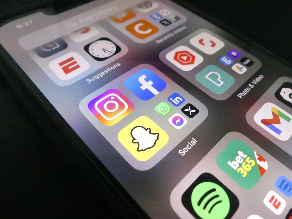
"Frankenstein UI" is a persistent headache in product design. A team runs out of icons in their initial open-source pack and starts patching in assets from different libraries. Suddenly, the user profile icon has a 2px stroke while the settings cog has a 3px stroke. Corner radii clash. The visual language falls apart.
Building a proprietary icon system in-house solves this, but it drains resources. You need dedicated illustrators to maintain thousands of metaphors. Icons8 addresses this specific scalability problem. It offers a massive, centrally managed library where consistency is the primary feature, not an afterthought.
Icons8 holds 1.4 million assets, but the volume matters less than the structure. Unlike marketplaces where thousands of contributors upload varying styles, Icons8 manages its styles centrally.
Select "Material Outlined" for an Android project. You immediately have access to over 5,500 icons that strictly adhere to that specific grid and stroke weight. Switch to "iOS 17," and you get 30,000+ icons matching Apple’s Human Interface Guidelines. Product teams can effectively outsource the maintenance of their visual vocabulary. You subscribe to an external design team that updates your icon set whenever Apple or Microsoft refreshes their design languages.
To understand where this tool fits, look at how different roles use the library in production environments.
A product designer needs to update a SaaS platform’s navigation and action menus. The current icons are a mix of FontAwesome and random SVGs. The goal: a clean, modern look native to Windows 11.
The designer installs the Figma plugin or opens Pichon, the Mac app for drag-and-drop functionality. They select the "Windows 11" style. Because the library covers niche metaphors, they find specific assets for "database migration" and "user permissions" without leaving their design tool. Vector versions drop directly onto the canvas. Since the icons sit on a consistent grid, they align with existing typography and spacing tokens. The designer creates a component set in Figma, confident that a new icon needed next month will match perfectly.
Design handoff is complete. The developer needs to implement the assets. Exporting SVGs from design tools often results in messy code filled with unnecessary metadata or clipping masks.
Instead of manual exports, the developer navigates to the specific asset on the Icons8 site. For standard UI elements, they copy the Base64 code to embed the image directly into the HTML. This reduces HTTP requests. For a loading state, they switch the filter to "Animated" and download a Lottie JSON file. They implement a smooth, vector-based animation that scales on high-density displays without pixelation. It maintains the exact visual weight of the static icons used elsewhere in the app.
Picture a content manager working on a tight deadline for a new landing page. They need to visualize four distinct features: "Cloud Sync," "Team Collaboration," "Analytics," and "Security."
They search for "Cloud Sync." Results show hundreds of options. They filter by "3D Fluency" to match the brand’s playful tone. A cloud icon appears, but the default blue clashes with the company's purple branding.
Rather than downloading the asset and opening Photoshop, they click "Edit" in the browser. They use the recolor tool to swap the blue for their specific brand HEX code. The icon feels too floating, so they add a square background element within the editor and adjust the padding.
Next, they search for the "Security" icon in the same style. They apply the saved color palette from the previous step. They repeat this for all four assets. Finally, they download them as high-resolution PNGs. The whole process takes ten minutes. The result looks like a custom-commissioned 3D set.
The icon market is crowded. Choosing the right source depends on budget and scope.
Icons8 vs. Open Source (Feather, Heroicons)
Open-source packs like Feather or Heroicons work well for early-stage MVPs or personal projects. They are free and code-friendly. But they are limited. A pack might have 200-300 icons. You hit a wall as soon as you need something specific-like "biometric passport" or "invoice recurring." Icons8 wins on depth; you rarely run out of metaphors.
Icons8 vs. Marketplaces (Flaticon, Noun Project)
Marketplaces aggregate content from thousands of independent designers. Variety is infinite, but consistency is the casualty. You might find a perfect "dog" icon, but the matching "cat" icon from the same artist doesn't exist. Icons8 functions like a factory rather than a bazaar. Styles are standardized across the entire library. A "Business" icon set matches the "Healthcare" set visually.
Icons8 is not the right solution for every project.
Strict Brand Ownership
Some clients require full intellectual property ownership of every asset in their product. You cannot use a stock library in these cases. You are licensing these icons, not buying the copyright. Enterprise brands trademarking their UI elements must choose custom design.
Artistic Uniqueness
The 45+ styles are designed to be universally applicable. Brands relying on a highly specific, gritty, hand-drawn aesthetic or unique abstract geometry will find stock icons too generic.
The Paywall for Vectors
The free tier is generous but restricts you to PNGs up to 100px. This works for mockups or slide decks. For modern web development and responsive app design, SVGs are non-negotiable. You need a paid subscription to access the vector formats required for professional production builds.
Use Collections for Batch Processing
Stop downloading icons one by one. Create a "Collection" for your project. Drag multiple icons into a collection and apply a bulk recolor to the entire set. If you change your primary brand color, update fifty icons in seconds and re-download them as a sprite or individual files.
Check SVG Formats
Watch the "Simplified" checkbox when downloading SVGs. Icons8 simplifies vector paths by default to reduce file size and clean up the code. But if you plan to animate individual paths (like making clock hands spin) using CSS or JS, uncheck this box. You need the original groups and layers intact.
The Request Feature is Real
Most library "request" forms are black holes. Icons8 operates a community voting system. Submit a missing icon. If it gets community likes, they actually produce it. It’s a viable way to fill gaps without breaking style consistency.
Edit Composites in Browser
The in-browser editor handles basic composition. Add text or sub-icons (overlays) directly. Need a "User Error" icon? Take a "User" icon, overlay a "Warning" triangle, adjust the position, and merge them before downloading. This is often faster than doing composite work in Illustrator.
Icons8 serves as a utility service for design teams rather than a gallery. It trades the infinite artistic variety of a marketplace for the rigorous, predictable consistency of a design system. For teams needing to scale their UI without scaling their design headcount, it is a pragmatic solution.
Discover our other works at the following sites:
Danetsoft is a global web agency headquartered in Indonesia, specializing in web development, managed hosting, and web publishing platform.
© 2026 Danetsoft. Powered by HTMLy