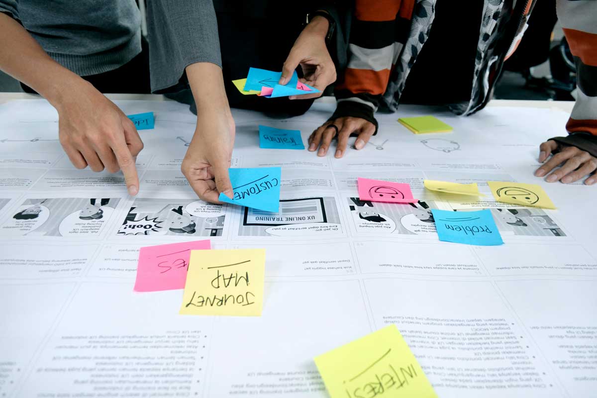
 Photo by UX Indonesia on Unsplash
Great product design is not just about making something look polished. It is about creating an experience that feels clear, helpful, and easy to trust. When people open an app or website, they do not want to spend time decoding it. They want to understand it quickly, move through it without friction, and feel confident that they know what to do next.
That is where UI and product design come together.
UI design shapes the visible layer, the buttons, spacing, typography, colors, and interaction details users touch every day. Product design goes broader. It asks what problem we are solving, who we are solving it for, and how every part of the experience works together to help people succeed. Strong products are built when both sides support each other.
In many teams, UI gets treated like decoration, while product design gets treated like strategy. In reality, the two depend on each other. A smart product idea can still fail if the interface feels confusing. A beautiful interface can still fail if the product does not solve a real problem. Good design sits right in the middle.
People judge digital products fast. Sometimes they decide within seconds whether they trust something enough to keep using it. That first impression is shaped less by marketing and more by the product experience itself.
When the design works well, users do not need to think too hard. They can focus on what they came for, whether that is booking a ride, checking a balance, ordering food, or managing a task list. Good design removes unnecessary effort.
Every extra click, unclear label, or awkward layout adds friction. Small moments of confusion pile up quickly. A user may not complain out loud, but they will feel the tension. They might leave, switch to a competitor, or simply stop using the product.
A clear UI helps people move forward with confidence. Product design makes sure the flow itself makes sense. Together, they reduce the mental load.
Trust does not come only from security badges or privacy policies. It comes from consistency, clarity, and the feeling that the product behaves as expected. If a button looks clickable, it should click. If a form says “Save,” it should save. If an action has consequences, users should know that before they take it.
Design is full of these trust signals. Small, thoughtful details can make the difference between a product that feels reliable and one that feels risky.
It is easy to jump into wireframes and color choices too early. But strong design starts before the first layout appears. We need to understand the problem deeply.
Different users have different goals, habits, and levels of confidence. A design that works for a tech-savvy user may feel overwhelming to someone less experienced. A dashboard for a manager needs different priorities than a mobile app for a shopper in a hurry.
Understanding the audience helps us choose the right level of detail, language, and interaction style.
Every product is hired to do a job. Sometimes that job is practical, like helping people pay bills or track mileage. Sometimes it is emotional, like helping them feel calm, organized, or inspired.
When we know the real job, we can design around it. If the main goal is speed, then shortcuts matter. If the goal is reassurance, then explanations and confirmation states matter. If the goal is exploration, then discovery tools matter.
Pain points are often hidden in routines people have learned to tolerate. Users may not describe them clearly, but they show up in behavior. They abandon sign-ups. They search for hidden features. They call support. They use workarounds.
We should look for those moments and treat them as design clues. The best product improvements often come from removing one stubborn obstacle.
Visual design matters, but it is only one part of UI. A pretty interface that confuses people is still a bad interface.
Good layout helps users understand what matters first, second, and third. This is where spacing, hierarchy, and alignment do a lot of quiet work. People should know where to look without needing a tutorial.
A strong visual hierarchy usually includes:
When layout is organized well, the interface feels calmer and easier to scan.
Text is often the main interface. Buttons, labels, instructions, warnings, and messages all depend on typography working well.
Readable type helps users move quickly. Good type choices also create tone. A product can feel warm, formal, playful, or efficient depending on the voice and typography pairing. We should never treat text styling as an afterthought.
Color can attract attention, show status, create brand identity, and improve navigation. But it should not carry all the meaning by itself. If red always means error, it should stay that way. If green means success, it should remain consistent.
We also need to think about accessibility. Color contrast matters. Meaning should not rely only on color, because many users will not experience it the same way.
A tiny animation, a hover state, a loading shimmer, or a subtle confirmation can make the interface feel more responsive and human. These moments are small, but they help users understand that the product is listening.
Microinteractions should never become noise. Their job is to clarify, reassure, and guide.
If UI design is about the surface, product design is about the journey beneath it. It shapes how the experience unfolds over time.
A product is not just a collection of screens. It is a sequence of decisions. Each step should prepare the user for the next one.
For example, a checkout flow should not ask for unnecessary information before the user understands the total cost. A project management tool should not hide the core task too deeply under menus. A design system may be visually strong, but the product still fails if the path through it feels disjointed.
It is tempting to keep adding features because they seem useful in isolation. But every new option adds complexity. Product design asks whether a feature helps the core experience or distracts from it.
More is not always better. Often, the most valuable improvement is simplification.
Limited time, budget, technical scope, and business goals are not barriers to design, they are part of it. Constraints force us to prioritize. They make the product sharper.
When we accept constraints early, we can design with realism instead of wishful thinking. That usually leads to better decisions and stronger results.
People want products to be easy, but they also want them to feel like they belong to a brand. This is where many teams struggle. They either build something sterile and forgettable, or they add so much personality that the product becomes harder to use.
If users cannot understand the interface, style will not save it. Clear labels, predictable patterns, and straightforward flows should always take priority.
The most elegant product is the one that solves the problem with the least confusion.
A little character can go a long way. It can make a product feel friendly, clever, or confident. Tone of voice, illustration style, motion, and color can all help a product stand out.
But personality should reinforce the task, not distract from it. If users are trying to complete something important, the design should not get in their way.
Users learn patterns quickly. When buttons, messages, and navigation behave consistently, they feel safe. Inconsistent design makes people hesitate.
That is why design systems matter. They help teams keep the product coherent as it grows. More importantly, they help users build trust through familiarity.
It is easy to feel confident about a design when we have looked at it too long. Real users bring the truth back into the room.
During usability testing, users often show us problems we never noticed. They click the wrong thing. They misunderstand a label. They skip over an important step. None of this means the design is bad, it means we finally have evidence.
Those moments are valuable because they reveal the gap between what we intended and what people actually experience.
Vague feedback like “make it feel better” is hard to use. Better feedback comes from observing behavior and asking simple questions. Where did users hesitate? What did they expect to happen? What made them feel unsure?
This kind of feedback helps us make meaningful changes instead of guessing. By improving how feedback is captured, jotform alternatives can help gather clearer user responses through better form design, making it easier to identify specific usability issues and act on them effectively.
Great products are rarely perfect on the first pass. Design improves through cycles of building, testing, learning, and refining. That process is not a failure of the original idea, it is how good ideas become useful.
We should treat iteration as normal, not as a correction.
Accessible design is not a bonus for a small group of users. It is part of making the product work well for more people.
Users may navigate with keyboards, screen readers, voice input, or different vision levels. Some users may need larger text, stronger contrast, or simpler layouts. Accessible design helps us account for all of these realities.
Many accessibility practices also improve the experience for everyone else. Clear headings help scanning. Good contrast improves readability. Large tap targets help mobile users. Straightforward language reduces confusion.
What is inclusive is often also just better design.
It is much easier to build accessible products from the beginning than to fix them later. When accessibility is part of the design process, we avoid rushed compromises and create more durable solutions.
UI and product design do not live in a vacuum. They depend on collaboration across product, engineering, research, content, and support.
When teams align around goals, users benefit. Designers bring structure and clarity. Developers bring feasibility and implementation insight. Product managers bring direction and prioritization. Researchers bring evidence. Writers bring precision. Support teams bring real-world pain points.
The stronger the collaboration, the better the product decisions. This interconnected approach reflects the principles of strategic portfolio management, which aligns enterprise resources and cross-functional teams to ensure every initiative directly supports overall business objectives.
A lot of design problems come from gaps in understanding, not from bad ideas. If we explain the reasoning behind our choices, it becomes easier for the team to support them. If we invite input early, we avoid expensive changes later.
Sometimes the sharpest insight comes from someone looking at the product from a different angle. A support agent may notice a common complaint. An engineer may spot a technical simplification. A writer may tighten unclear wording.
When we stay open, the product gets better.
Trendy interfaces can be tempting, but products need to last. A design that feels exciting today should still make sense when the product grows tomorrow.
Patterns, components, and rules help a product scale. They reduce inconsistency and make updates easier. This does not mean everything has to look identical. It means the product should have a stable foundation.
Products evolve. New features arrive. User needs shift. Business goals change. Good design leaves room for growth without breaking the experience.
No matter how large the team gets or how complex the product becomes, the core question stays the same, does this help people do what they came here to do?
If the answer is yes, we are probably on the right path.
UI and product design are at their best when they quietly solve problems, remove friction, and help people feel capable. The interface should not demand attention for its own sake. It should guide, support, and disappear into the background once it has done its job.
When we design with empathy, clarity, and discipline, we create products that people not only use, but enjoy. That is the real aim. Not just screens that look good, but experiences that feel smooth, trustworthy, and worth coming back to.
Discover our other works at the following sites:
Danetsoft is a global web agency headquartered in Indonesia, specializing in web development, managed hosting, and web publishing platform.
© 2026 Danetsoft. Powered by HTMLy