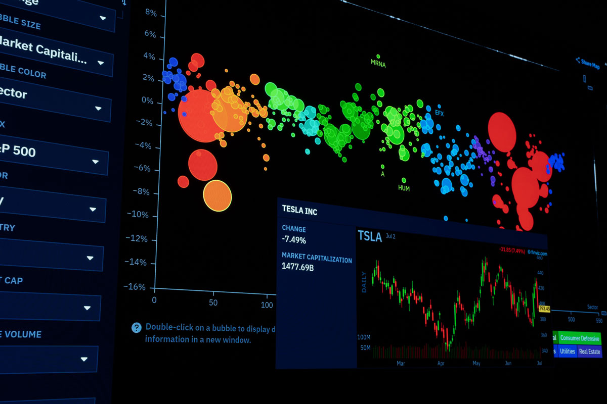
 Photo by Rafael Minguet Delgado on Pexels
Data alone rarely tells the full story. A spreadsheet can show sales figures, website traffic, budget changes, or customer behavior, but the meaning often stays hidden until we shape those numbers into something visual. That is where data visualization tools step in. They help us turn raw information into charts, dashboards, maps, and reports that are easier to read, compare, and explain.
In everyday work, this matters more than it used to. Teams move faster now, decisions are made more often, and data comes from more places than ever. Marketing teams need to see campaign results quickly, finance teams need to monitor spending without delay, product teams need to understand user behavior, and managers want a simple view of performance without digging through endless tables. A good visualization tool brings all of that into focus.
This article looks at what these tools do, why they matter, how different types compare, and what we should look for when choosing one. It also covers common mistakes, useful chart types, and the way these tools support different teams across an organization.
Data visualization tools are software applications that help us present data in visual form. Instead of scanning rows of numbers, we can view the same information as bar charts, line graphs, scatter plots, heat maps, and dashboards. The goal is not just to make things look nicer, it is to make the data easier to understand and use.
A strong tool helps us:
Some tools are simple and built for quick reporting. Others are more advanced and designed for analysis, dashboards, and live monitoring. The right choice depends on the kind of work we do and the people who need to use the results.
Humans are good at noticing patterns when information is shown visually. A chart can reveal what a table hides. For example, if revenue is rising every quarter, a line graph makes that trend obvious in seconds. If one region is underperforming, a bar chart can show the gap immediately.
That speed matters. In business, we often do not have time to study every detail manually. Visuals help us move from data to action much faster.
Line charts, area charts, and bar charts help us see change over time or across categories. Instead of reading multiple rows, we can see growth, decline, spikes, and seasonal shifts at a glance.
A dashboard or chart often explains a point faster than a paragraph. When teams see the same visual, they usually reach the same understanding more quickly. That reduces confusion in meetings, reports, and presentations.
When the evidence is easy to see, decisions feel less abstract. If a product line is losing traction or a campaign is producing strong results, the chart makes that easier to act on.
Good visuals do more than display numbers. They show context, patterns, and direction. They help us answer not only what happened, but also what it might mean.
Not every tool serves the same purpose. Some are made for quick chart creation, while others support deep analysis, collaboration, or live reporting.
Many of us begin with spreadsheet software. These tools offer basic charting, pivot tables, and filtering options, which are useful for smaller tasks or simple analysis.
They are popular because they are familiar and easy to use. Most teams already know how to work in a spreadsheet, so there is little training needed.
Still, spreadsheet tools have limits. They can become difficult to manage with large datasets, and they are not the best fit for interactive dashboards or team-wide reporting.
Business intelligence, or BI, platforms are among the most widely used data visualization tools in companies. They connect to different data sources and let us build dashboards, reports, and interactive views.
These platforms are powerful because they often include:
They work well for organizations that need regular reporting and a shared view of performance. The tradeoff is that they can take time to learn, especially when data modeling is involved.
For teams that want complete control, coding libraries are a strong option. These are often used by data analysts, data scientists, and developers who need custom charts or advanced visuals.
Their biggest strength is flexibility. We can shape almost every detail, from color and layout to interactions and animations. They are ideal when standard dashboard tools are not enough.
The downside is that they require technical skill. For non-technical users, they may feel too complex for everyday reporting.
Many modern tools run in the browser and support collaboration across locations. These cloud-based platforms make it easier for teams to work together, share dashboards, and access visuals without heavy software installation.
They are often appealing because they simplify sharing and updates. Once a dashboard is built, users can view it from almost anywhere. That convenience is useful for remote teams and distributed organizations.
Choosing a visualization tool is not only about the number of chart styles it supports. The best tools save time, reduce confusion, and fit the way we already work.
A strong tool should connect easily to the sources we already rely on, such as Excel files, SQL databases, cloud services, CRMs, or APIs. If the data connection is awkward, the whole process becomes slower and more fragile.
Interactivity gives users more control. Filters, drill-downs, hover details, and click-through options let people explore the data without rebuilding the report each time. That makes analysis feel more natural and more useful.
If a tool is hard to learn, people may avoid it. A simple interface, drag-and-drop layout, and clear labeling can make a big difference. This matters especially when the audience includes business users instead of technical specialists.
Visuals should match the message. That means we should be able to adjust colors, labels, number formatting, chart size, and layout. Good customization helps us create visuals that are both useful and easy on the eyes.
Most teams do not work alone. Shared dashboards, comments, export options, and version control help people review data together and keep everyone aligned.
Business data often includes sensitive details. A useful tool should allow role-based access, secure sharing, and permission controls. That way, we can share the right information with the right people.
A dashboard should load quickly and respond well when users apply filters or switch views. Slow visuals frustrate users and reduce trust in the tool.
Even the best tool cannot fix a poorly chosen chart. The visual format has to match the data and the message.
Bar charts are one of the clearest ways to compare categories. We can use them for sales by region, visits by channel, or counts by product. They are easy to read and work well for side-by-side comparisons.
Line charts are excellent for time-based data. They help us follow trends, growth, decline, and seasonality. If we want to understand how something changes over days, months, or years, a line chart is often the right choice.
Pie charts show proportions, but they work best when there are only a few segments. Once the slices become too numerous, the chart gets harder to read. In many cases, a bar chart gives us a cleaner comparison.
Scatter plots help us study the relationship between two variables. They are useful for spotting clusters, correlations, and outliers. For example, we might compare ad spend and revenue to see whether the two move together.
Heat maps use color to show density, intensity, or patterns across a matrix. They are useful for identifying busy periods, popular areas, or concentrated activity. They are especially effective when we need to see patterns in a large amount of data.
Dashboards combine several visuals into one view. They are useful for monitoring key metrics and giving us a quick overview of performance. A strong dashboard usually includes a mix of charts, summary numbers, and filters that support exploration.
The value of data visualization becomes clearer when we look at the way different teams use it every day.
Marketing teams use visual tools to track campaign performance, website visits, conversion rates, lead sources, and customer engagement. Dashboards help them see which channels work best and where results are slipping.
Sales teams rely on charts to monitor pipeline growth, deal closure rates, average deal value, and performance by territory or rep. These visuals help teams spot opportunities and identify weak spots early.
Finance teams use dashboards to follow budgets, revenue, expenses, forecasts, and cash flow. With the right charts, they can review performance quickly and support planning with better visibility.
Product teams study feature use, retention, user journeys, and release outcomes. Visual reports help them understand how people behave inside a product and where users may be getting stuck.
Operations teams track delivery times, service levels, inventory, downtime, and process efficiency. Charts and dashboards make it easier to detect bottlenecks and improve day-to-day work.
The right visualization tool does more than make reporting prettier. It can improve how an entire team works.
Once a dashboard is connected to live data, it can update itself. That reduces the need to rebuild the same report every week or every month.
When everyone uses the same dashboard, there is less room for misunderstanding. A shared view keeps the team aligned and reduces debate over which numbers are correct.
Interactive tools let us explore from different angles. We can filter by product, location, date, or customer segment to uncover patterns that would be hard to find in a static report.
Clear visuals reduce the time between seeing a problem and acting on it. Instead of sorting through rows of data, we can focus on what the information means.
When data is visible and accessible, teams can discuss performance with a common reference point. That shared understanding leads to better teamwork.
Even useful tools can produce weak results if we use them badly.
When a dashboard has too many charts, colors, labels, and filters, the message becomes harder to find. Simplicity usually works better than overload.
Not every chart fits every dataset. A pie chart with too many pieces or a decorative chart with unnecessary effects can confuse people rather than help them.
If the underlying data is incomplete, duplicated, or inconsistent, the chart may look polished but still tell the wrong story.
A dashboard for executives should not look the same as one for analysts. The right level of detail depends on who will use it and what they need to know.
Without clear titles, units, legends, and notes, even a good visual can be misunderstood. People should not have to guess what a chart is showing.
There is no single best tool for every situation. The right choice depends on the work we need to do.
We should begin by asking what the tool needs to support. Is it for quick reporting, live tracking, deep analysis, or team dashboards? That question narrows the field fast.
If the users are not technical, ease of use matters more than deep customization. If the tool will be used by analysts or developers, flexibility may matter more.
A tool should connect smoothly to the systems we already use. If importing data is difficult, the workflow becomes slower and less reliable.
A tool that works well for one team may not scale across a company. We should think about licensing, permissions, collaboration, and speed as usage grows.
The most expensive platform is not always the best fit. What matters is how much time it saves, how useful it is to the team, and whether people will actually use it.
Data visualization is still evolving. Tools are becoming more interactive, easier to share, and more closely tied to live data. We are seeing more natural language search, more mobile-friendly dashboards, and more embedded analytics inside everyday business software.
Accessibility is also getting more attention. Visuals need to work for more people, which means clearer contrast, better labels, and support for different ways of reading data.
Self-service analytics is another major shift. More people want to explore data without waiting for a specialist to build every report. That means tools need to be simple enough for broad use, while still powerful enough for deeper work.
Data visualization tools help us turn raw numbers into clear, useful insight. They make patterns easier to see, communication easier to follow, and decisions easier to make. Whether we use a spreadsheet, a BI platform, a cloud tool, or a coding library, the goal stays the same, to make data understandable and actionable.
When we choose the right tool, match the chart to the message, and keep the audience in mind, data becomes much more than a pile of figures. It becomes something we can use to guide decisions, improve teamwork, and move with more confidence.


Discover our other works at the following sites:
Danetsoft is a global web agency headquartered in Indonesia, specializing in web development, managed hosting, and web publishing platform.


 [email protected]
 Magelang, Central Java
 © 2026 Danetsoft. Powered by HTMLy